Reimagining Content Discovery at Philo

Philo
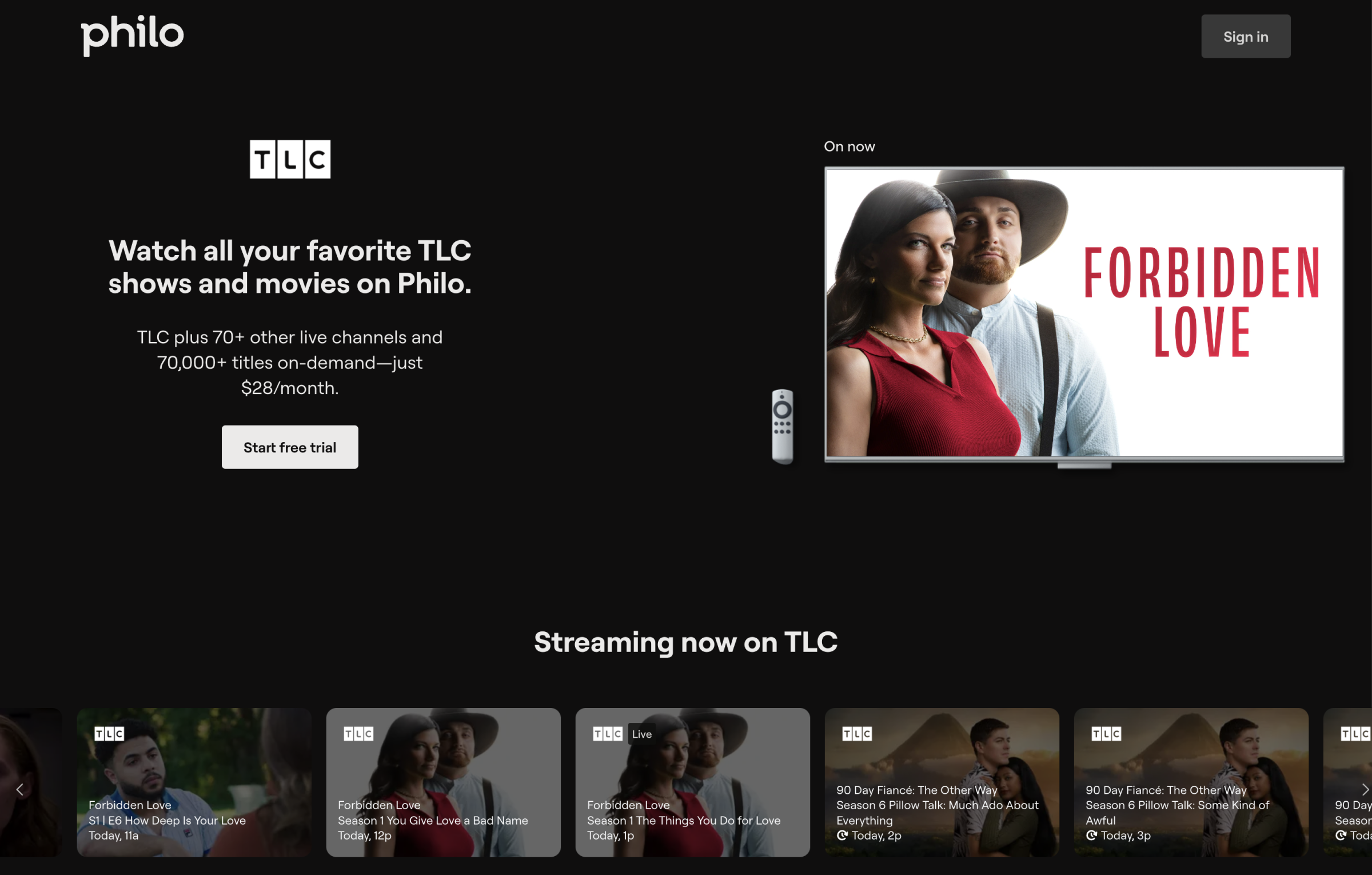
Philo is a streaming service that offers live TV, on-demand content, and unlimited DVR storage. During my internship, I redesigned the existing show pages and introduced new browsing pages—such as "All Shows," "All Movies," and "All Channels"—to help users easily identify and discover our content. Through this undertaking, we aimed to attract more long-term customers by simplifying their experience and making it easier for them to find content that aligns with their interests.
Timeline
September - December 2024
Role
Product Design Intern
Skills
Interaction Design
Data Analytics
Cross-team Collaboration

PROBLEM

Philo’s Vast Content Library Lacked a Browsing System, Making Discovery Difficult and Contributing to Low Conversion Rates and High One-Month Subscription Cancellations

Philo offers a vast content library, including over 70 live TV channels and 75,000 on-demand titles. However, there was no effective way to showcase this extensive offering to potential subscribers. Without an intuitive browsing experience, users struggled to discover relevant content, limiting their ability to evaluate whether Philo’s diverse catalog met their interests before committing. This lack of visibility contributed to low conversion rates and high trial cancellations.

RESEARCH

Competitive Analysis

Prime Video
Youtube TV
Hulu
Crunchy Roll
Peacock
Prime Video emphasizes visually engaging, with dynamic tiles, hover states, and interactive trailers. It prioritizes content discovery through immersive visuals, making it fun but potentially overwhelming for our older user base.
YouTube TV has a straightforward UI with minimal CTAs, relying on its robust search and filtering system for content discovery. While it’s functional, it lacks visual appeal and contextual cues, making the experience a bit flat.
Hulu provides strong visuals and preset content sections, but lacks detailed filters. The navigation bar is intuitive, making it easy to jump between pages, but it could be more consistent across the site.
Crunchyroll offers a content-heavy, visually dynamic interface with lots of interactive hover states and varied tile formats. While, the filtering options are limited, they're satisfactory, contributing to an enjoyable, engaging experience.
Peacock’s landing page prioritizes essentials, but the interface is text-heavy and visually inconsistent. Additionally, the different browsing pages lack uniformity, with significant differences in layout and design.

PAIN POINTS

Enhancing content discoverability is key to converting potential users into loyal Philo subscribers

Prospective users can only find content by directly searching for specific titles or navigating within the app—limiting their ability to explore Philo’s extensive library before subscribing. This makes it harder to attract new users who may benefit from previewing available content. Additionally, many users sign up for one month but cancel shortly thereafter, indicating a need for more effective ways to engage them. By improving content discovery and allowing potential subscribers to easily preview content, we aim to help them make more informed decisions, increasing the likelihood of converting trial users into long-term customers.
person_search
Potential Customers are unable to explore the full breadth of our content
Currently, potential customers can only find Philo content by searching for specific show and movie titles on Google or navigating within the app as existing users. This limitation risks losing potential subscribers who might benefit from exploring our extensive library before making a commitment.
free_cancellation
Most new users cancel their subscriptions after only one month
Our hypothesis was that by allowing potential customers to preview available content, they would make more informed decisions about subscribing to Philo. This clarity could lead to more committed long-term users, who are confident that Philo meets their entertainment needs.

THE DESIGN GOAL

To drive long-term user engagement by rethinking Philo’s content discovery strategy, prominently showcasing our features, and facilitating easy exploration for more informed subscription decisions

IDEATION

I explored different approaches such as transforming the previews into cards, modifying the style and functionality of the graph, and adding color and accents to the table. These explorations deepened my understanding of Athena and helped define the scope of my project. However, none of these solutions fully capitalized on the available opportunities or addressed all the major pain points.

FINAL DESIGNS

Leading with our content and showcasing our extensive catalog will enhance content discoverability, resulting in higher conversion rates and improved user retention.

Our new browsing pages offer a broad overview of all our content, showcasing eye-catching visuals and user-friendly filtering options. We’ve highlighted our most popular titles and provided context with genres, ratings, and descriptions. These updates not only simplify content discovery but also align perfectly with our goal of driving long-term engagement and empowering users to make informed decisions about their subscriptions.
Explore the Live Site

REDESIGNS

DESIGN DETAILS

Interaction & Hover States
The visual design of the browsing pages plays a key role in user engagement. We used large, eye-catching visuals of shows and movies to help users quickly identify and engage with content that interests them. By incorporating interactive hover states, we added another layer of dynamic interaction, allowing users to easily preview content without needing to click through to a show’s page. This immediate visual feedback helps users make faster, more informed decisions, ultimately improving retention and interaction rates. The combination of clean, bold visuals with thoughtful interactions creates a compelling, enjoyable browsing experience.
Responsiveness Across Devices
The company as a whole was undergoing a redesign, so a key consideration was ensuring that the browsing experience is fully responsive, providing a seamless experience across all devices. Whether users are on desktop, tablet, or mobile, the interface adapts to the screen size while maintaining usability and performance. This flexibility allows potential subscribers to browse Philo's content effortlessly, whether they’re on the go or at home, creating a consistent, high-quality experience regardless of the device.
Optimizing SEO
To drive visibility and attract potential subscribers, we focused on SEO optimization by interlinking our new All Shows, All Movies, and All Channels pages. This ensures they’re easily discoverable by search engines, increasing organic traffic and providing potential customers a direct path from search to subscription. Users can access these pages through both the navigation bar and footer, which creates a smooth connection across Philo’s content. The intuitive design allows for easy transitions between categories, making it simpler for users to explore and engage with Philo’s offerings, while simultaneously boosting our online presence.

IMPACT

The anticipated impact of these changes is substantial. By simplifying content discovery and improving content visibility, we expect to see a notable increase in both user sign-ups and long-term retention rates. A more intuitive and engaging browsing experience should also boost conversion rates from trial to paid subscriptions, helping Philo retain more of its potential customers.

While we continue to collect data on the full impact of these changes, early results from similar updates—such as the redesigned show pages and new CTAs in the hero sections—are already showing positive outcomes. Specifically, these changes led to a 4% increase in first payment rates, contributing an estimated $260k in revenue.

As more users explore Philo’s offerings through the new browsing pages, we anticipate even greater results moving forward. By making content more discoverable and engaging, we are positioning Philo for sustained growth, with higher conversion rates and stronger customer retention.

TAKEAWAYS

01
Data-Driven Design and Continuous Experimentation
This project marked my entry into the streaming industry, providing invaluable insights into its unique challenges and opportunities. One key takeaway was the importance of continuous experimentation and testing. By analyzing user engagement metrics and refining designs based on real-world feedback, I gained a deeper understanding of how thoughtful, evidence-based design can significantly increase user engagement and drive crucial business metrics, such as conversion rates and retention.
02
Content Discoverability and Cross-Disciplinary Design
Another major takeaway was the importance of content discoverability in retaining and converting users. Optimizing content through SEO strategies and ensuring seamless navigation between pages helped increase visibility and engagement. SEO was crucial not only for improving search engine rankings but also for making sure that the right content reached the right audience at the right time. This project also highlighted the value of cross-disciplinary thinking—where design decisions are informed by not just aesthetics, but also SEO, business objectives, and technical constraints. Understanding the intersection of design, user behavior, and revenue generation gave me a more holistic perspective on product development.